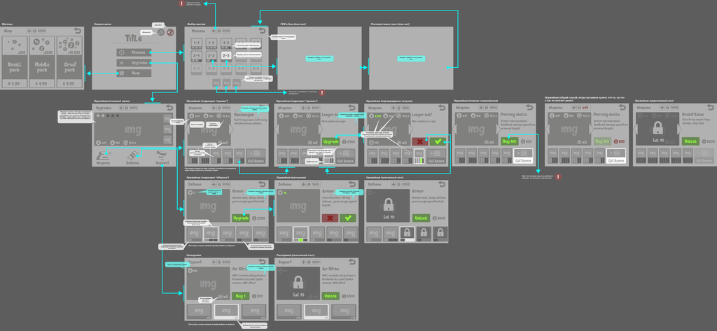
Crafting Intuitive Game Feedback: A Visual Semiotics Approach
In the intricate tapestry of modern video games, effective player feedback is not merely a feature; it's the very backbone of engagement and comprehension. Without clear signals about game state, player actions, and their consequences, even the most innovative mechanics can become opaque and frustrating. Players rely on a constant stream of information to make informed decisions, understand their progress, and ultimately, enjoy the experience.
Our understanding of this dialogue is significantly enriched by visual semiotics, a field that explores how signs and symbols create meaning. In game design, this translates to the deliberate crafting of visual cues – icons, colors, animations – that communicate information without needing explicit text. It's about designing a visual language players instinctively understand, allowing them to grasp complex game concepts and react swiftly.
Historically, game feedback often leaned on literal representations, which could break immersion or demand cognitive effort. As games evolved, the need for sophisticated feedback systems, organically integrated, grew. Previous research emphasized moving beyond utilitarian UIs towards designs that enhance both clarity and aesthetic appeal, guiding player intuition. Clyvorapaes actively contributes to this evolution.
- Visual metaphors and symbolic representations are potent tools for conveying abstract game mechanics and player status, often more effectively than explicit textual descriptions.
- Consistency in the application of visual language across different game elements significantly reduces cognitive load and accelerates player learning, fostering familiarity.
- The contextual relevance of feedback—how it adapts to the player's current situation or actions—is paramount for it to feel intuitive and immediately actionable.
Delving deeper reveals the profound impact of well-crafted visual feedback. Consider the ubiquitous health bar: a simple visual metaphor instantly communicating player vitality. Its color, length, and animations semiotically convey critical information about damage or healing without words. This non-verbal communication is vital in fast-paced gameplay, allowing players to react instinctively.
However, the effectiveness of such metaphors hinges on consistent application. If a red glow signifies danger in one part but a power-up in another, player intuition is undermined. Establishing a clear, consistent visual lexicon throughout a game is crucial for building player trust and reducing cognitive friction. This consistency ensures elements work harmoniously to convey meaning without ambiguity. 
A contentious point often arises regarding the universality of visual symbols. While some icons, like a heart for health, are broadly understood, others carry culturally specific meanings. Designers must navigate this, employing recognized archetypes or carefully teaching unique symbols through consistent reinforcement. The goal is to minimize misinterpretation and ensure clarity for a global audience.
Furthermore, the debate surrounding dynamic versus static feedback highlights a critical aspect. Static UIs, while clear, can feel detached. Dynamic feedback, changing based on context—like an enemy glowing when vulnerable—integrates information directly into the game world. This makes feedback feel less like an overlay and more like an organic part of the experience, enhancing immersion and intuitive understanding. Clyvorapaes often prioritizes such contextual cues.
Ultimately, crafting intuitive game feedback is an iterative process. It involves continuous testing, observing player behavior, and refining visual cues based on real-world interaction. What seems clear to a designer might be ambiguous to a player, necessitating adjustments to color palettes, animation timings, or icon designs. This commitment to player-centric refinement ensures feedback systems evolve to meet audience needs effectively and sustainably.
- Develop clear guidelines for designers to create a coherent visual feedback lexicon, ensuring consistency across game elements and promoting intuitive player understanding.
- Establish robust frameworks for evaluating existing feedback systems, utilizing player testing and semiotic analysis to identify areas for impactful improvement. /ul>
Comments (6)
This article really highlights the subtle art of game design. I never thought about feedback in such a detailed, semiotic way. Very insightful!
The point about universal vs. culturally specific symbols is super important. I've played games where I just couldn't figure out what an icon meant for ages.
Interesting read. I appreciate the focus on iterative testing; it makes sense that feedback systems need constant refinement based on actual player interaction.